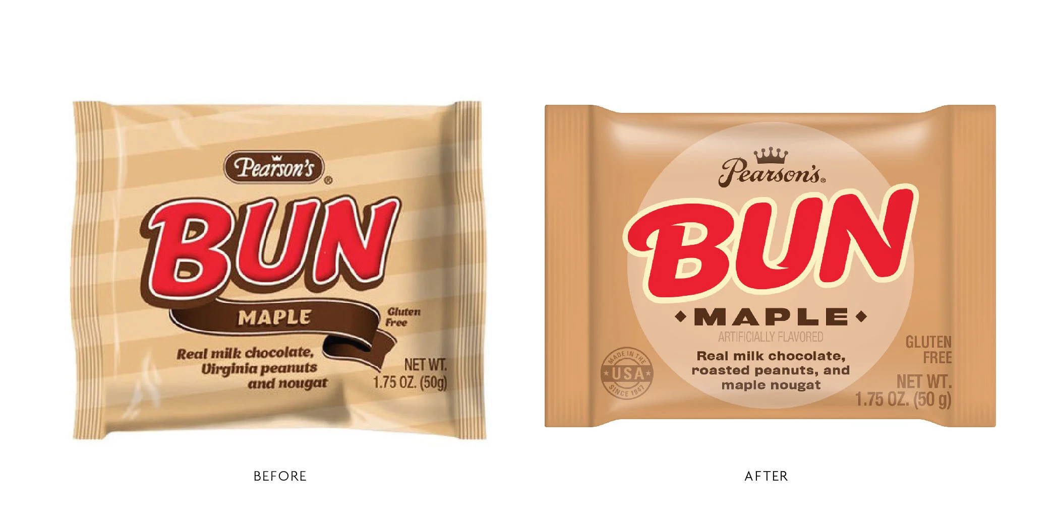

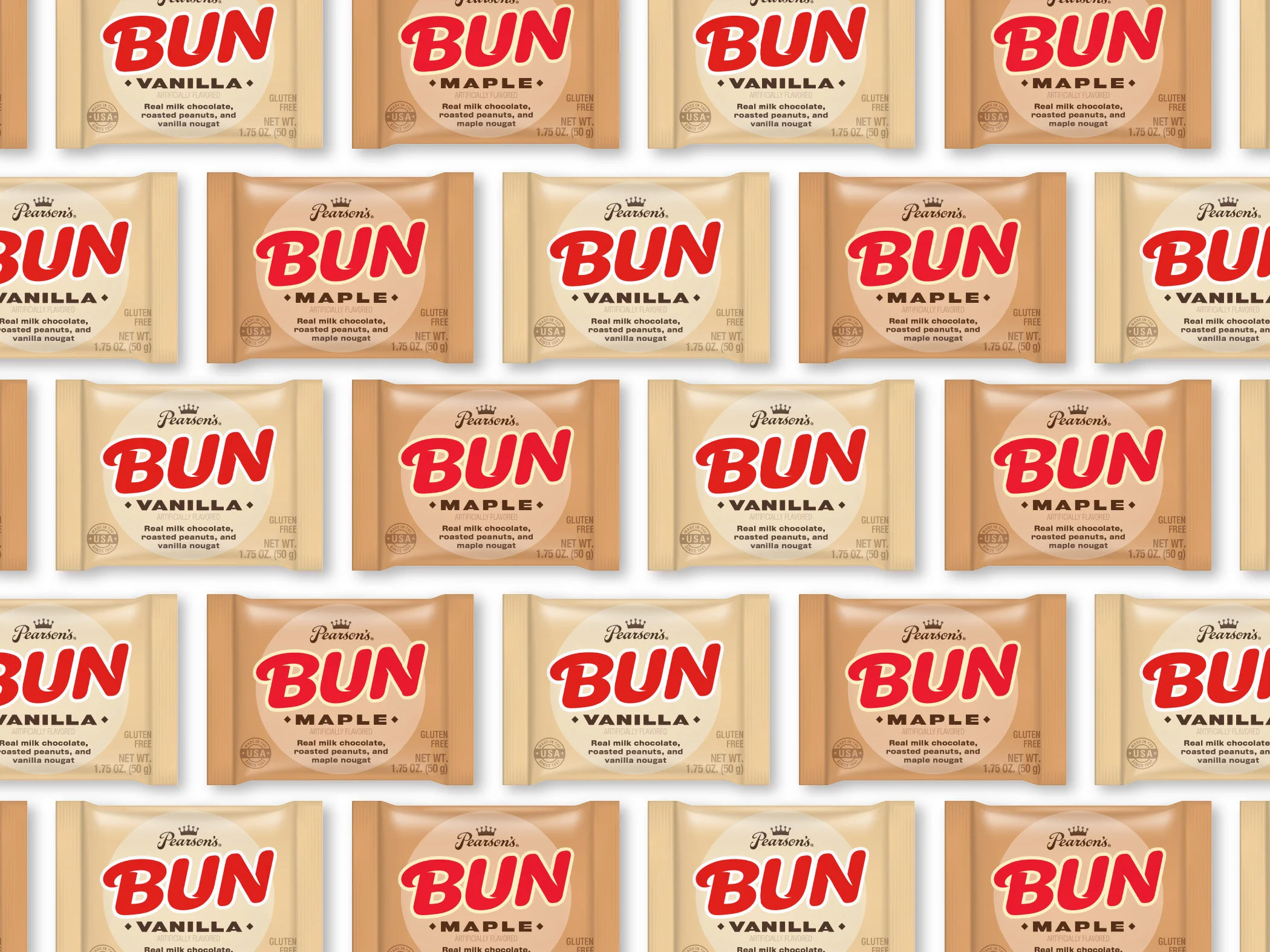

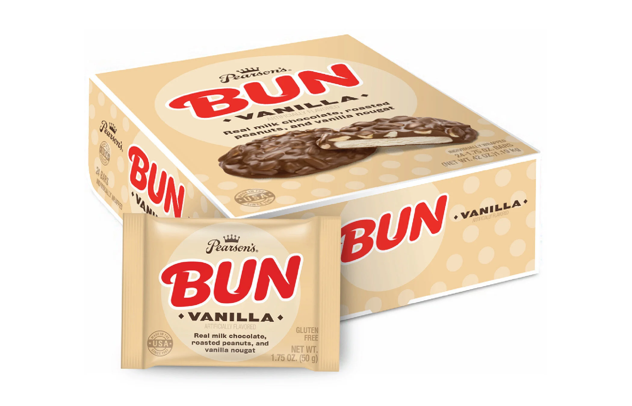
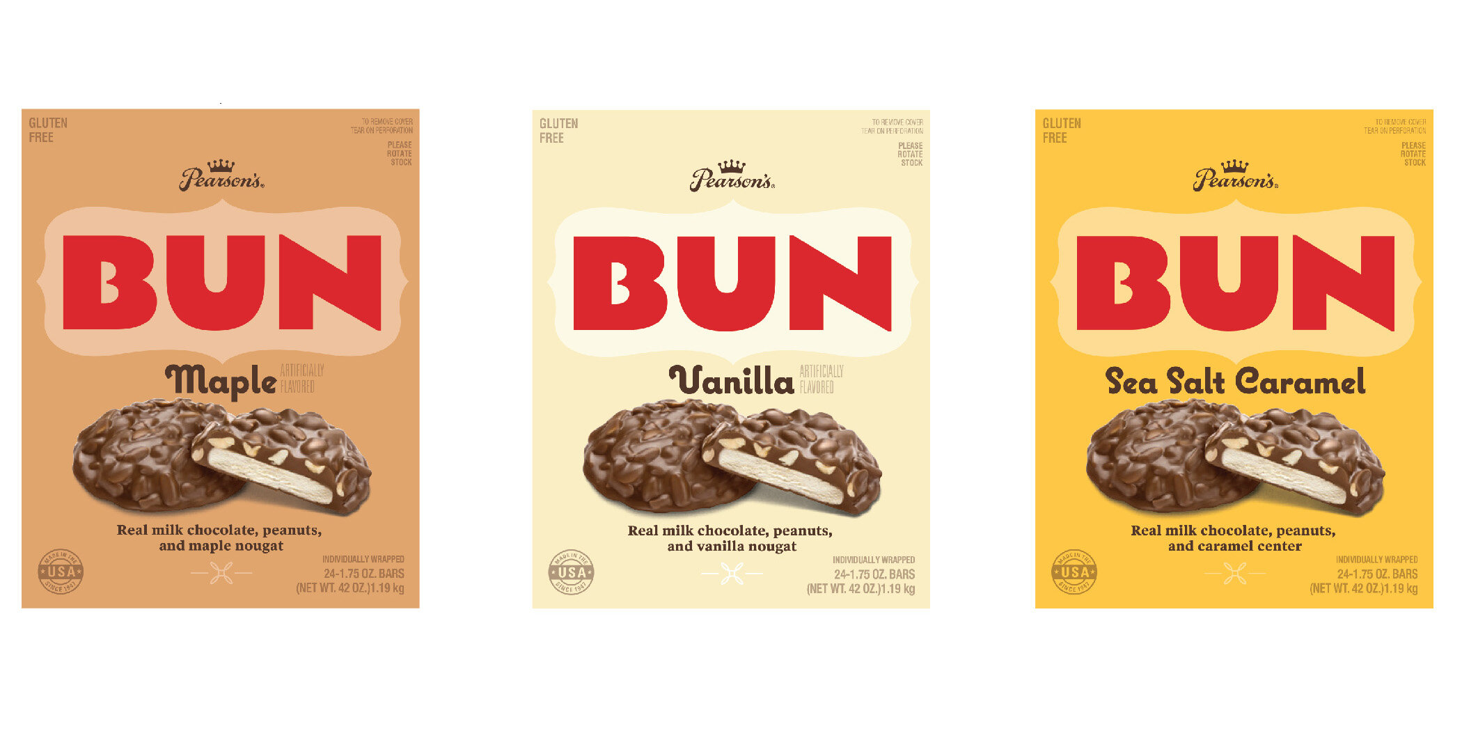

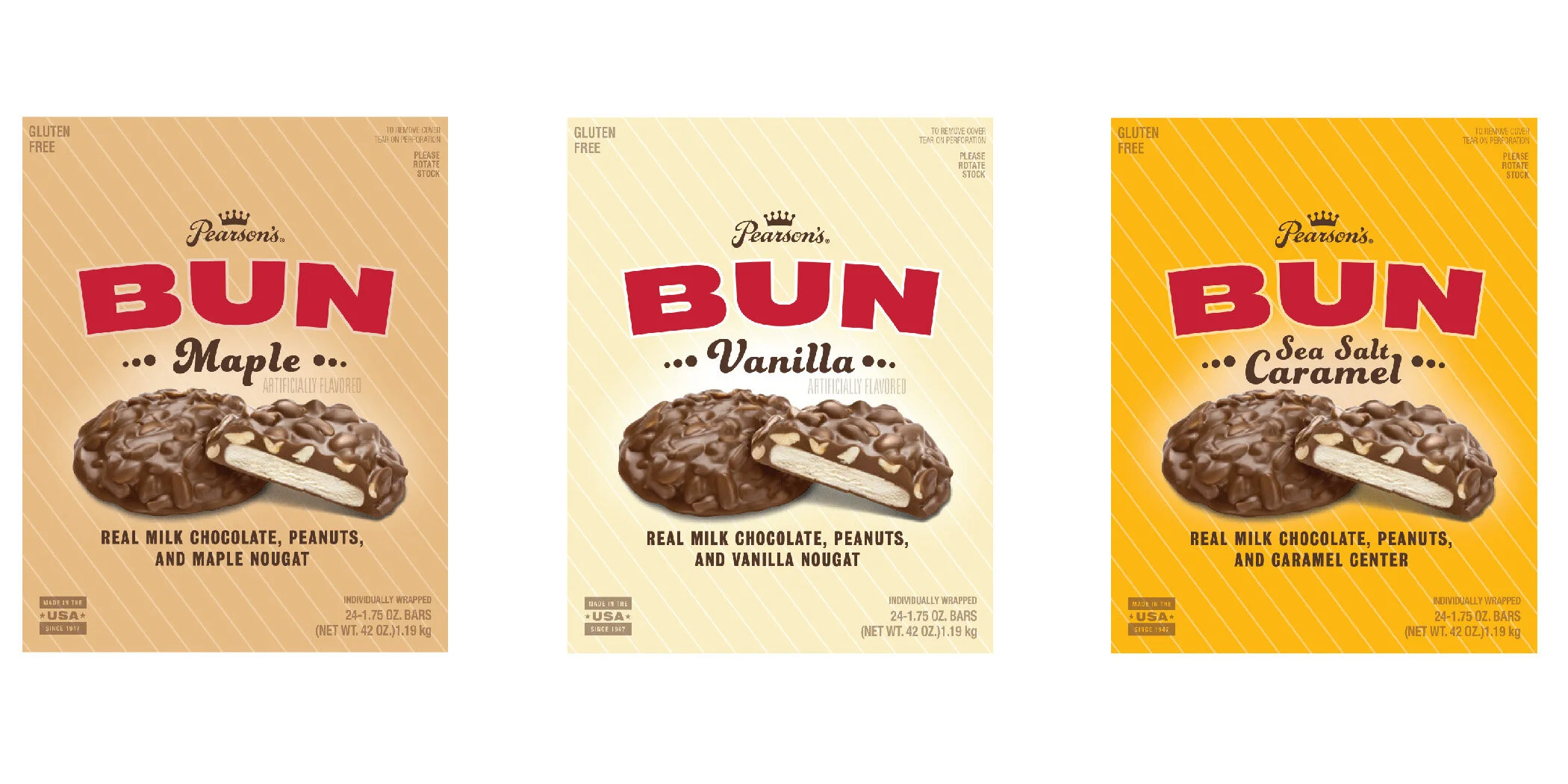
The BUN Bar is a nearly-identical sibling to the more famous Nut Goodie. Pearson’s Candy Company wanted to update this heritage brand (dating back to 1947), so I worked with Marks Minneapolis to revise the swash-y logotype, simplify the package typography, and add a holding shape that mirrors the circular candy bar.
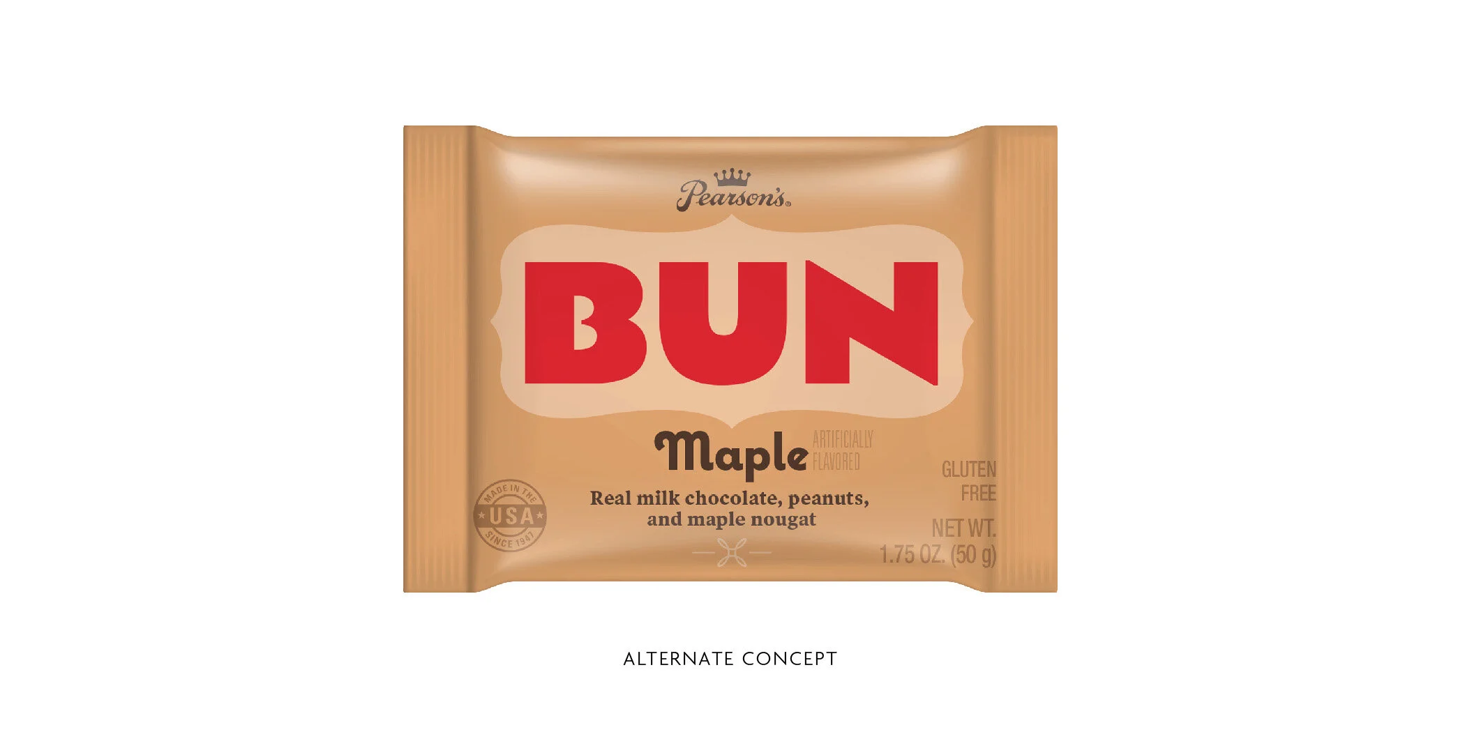
Included here are a couple of additional concepts that were presented before the final concept was chosen.
Design Director: Adam King
Additional designers: Laura Johnston
Agency: Marks Minneapolis
Client: Pearson’s Candy Company